About the Client:
STEAM is an approach to education that combines science, technology, engineering, the arts, and math into the curriculum for students to learn certain skills. Their curriculum aims to prepare students for a successful educational experience that leads them to develop skills necessary for college success.
The STEAM institution is a hypothetical up-and-coming university tailored to STEAM teaching and educational growth for future students.
The Challenge:
My task for this project was to create designs for a hypothetical public institution, STEAM. I needed to develop three different representative marks that depicted the essence of the institution clearly to those utilizing its facilities and the general public.
Representing a brand of the institution through multiple logo variations as well as creating indication icons for signage was the main goal to help identify the STEAM insitution. My primary focus was placed on a design wordmark and icons to identify specific venues present within the institution that was representative and easily understood.
Early-Stage Sketches and Mockups:
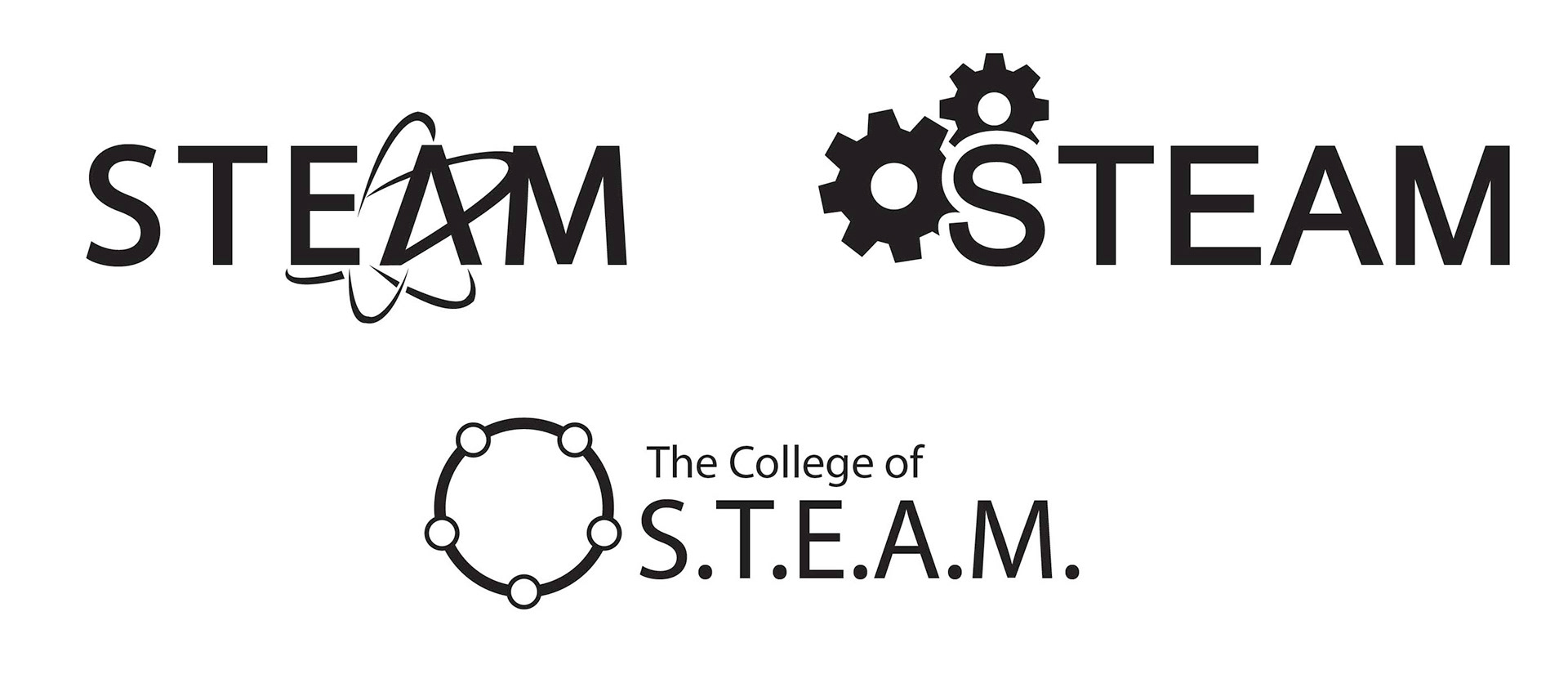
My first priority was to brainstorm some ideas for a logo that represented the STEAM institution and its educational purpose. With five subjects present within the institution, I focused on certain shapes and forms that represented the different aspects of what they teach. Circles were a reoccurring theme in my sketches and ideation process as they could join the five subjects together and show connection among them. I was able to determine what I wanted to focus on once I took my initial sketches and started drafting them out into digital concepts.


Digital Mockups:
After a few discussions with other design students, I decided that the circle symbol represented STEAM more effectively than the other two mockups. The other two wordmarks were too representative of a specific subject within STEAM instead of showing the connection among all five subjects. By not leaning toward one subject, the circle connecting science, technology, engineering, art, and math, made more sense as a logo for the institution.
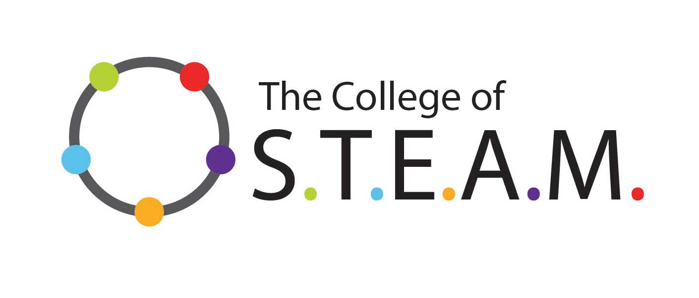
At this point, I was able to incorporate color into the previously black and white design. Each color was paired with a subject in the STEAM from the dots between the letters. For example, "S" is representative of science and was paired with green so the green dot on the circle was also representative of that same subject. This showed the connection among the subjects in STEAM and how they are present within the institution.
Wordmark/Logo:
The wordmark is the face of the STEAM institution and the main heading for documents, signage, and merchandise. The symbol can be separated from the institution's title or felt intact depending on what is desired. With both a black and white option as well as a colored version, the logo can be placed in different situations that seem fitting.


Venue Icons:
At the STEAM institution, these icon badges provide a clear distinction in room types in the campus buildings. Full-color badges are places outside the classroom settings to be seen and identified by passing students, faculty, and the public while in the facilities. They were designed to be placed either on the door or the wall near the entranceway for people to see and identify what venue they are looking for. The same colors as the wordmark are present to create cohesion and differentiate the rooms and their purposes. These were just three examples of what the venue icons would look like in representation of classroom type.

