About the Client:
Sammy's Subs is an up-and-coming online gourmet sandwich shop that uses companies like Doordash, Uber Eats, and other food delivery partners to deliver subs to customers.
The franchise creates franchises by utilizing spare kitchen spaces provided by local businesses. They strive to give more power to the independent entrepreneur and make franchise ownership budget-friendly and easier to start up than other foodservice chains.
The Challenge:
My task was to design the Order Now section and menu features for Sammy's mobile application. My primary goal was to deliver the information needed in a way that was easy to follow by customers so they could maneuver comfortably throughout the different pages.
Since Sammy's revolves heavily around the success of their app, I needed to make sure customers had a good ordering experience and would want to continue using the app in the future.
Low Fidelity Sketches:
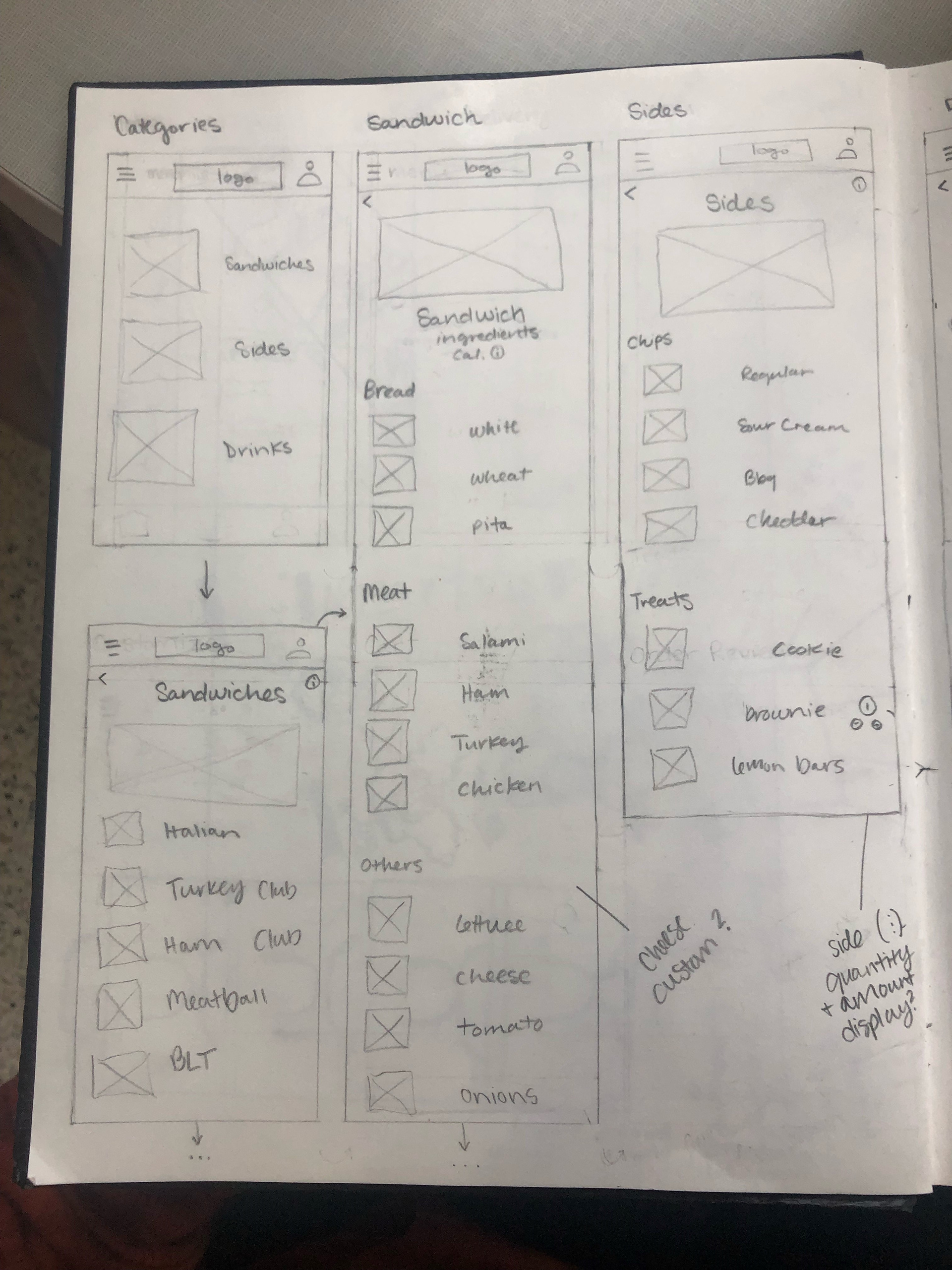
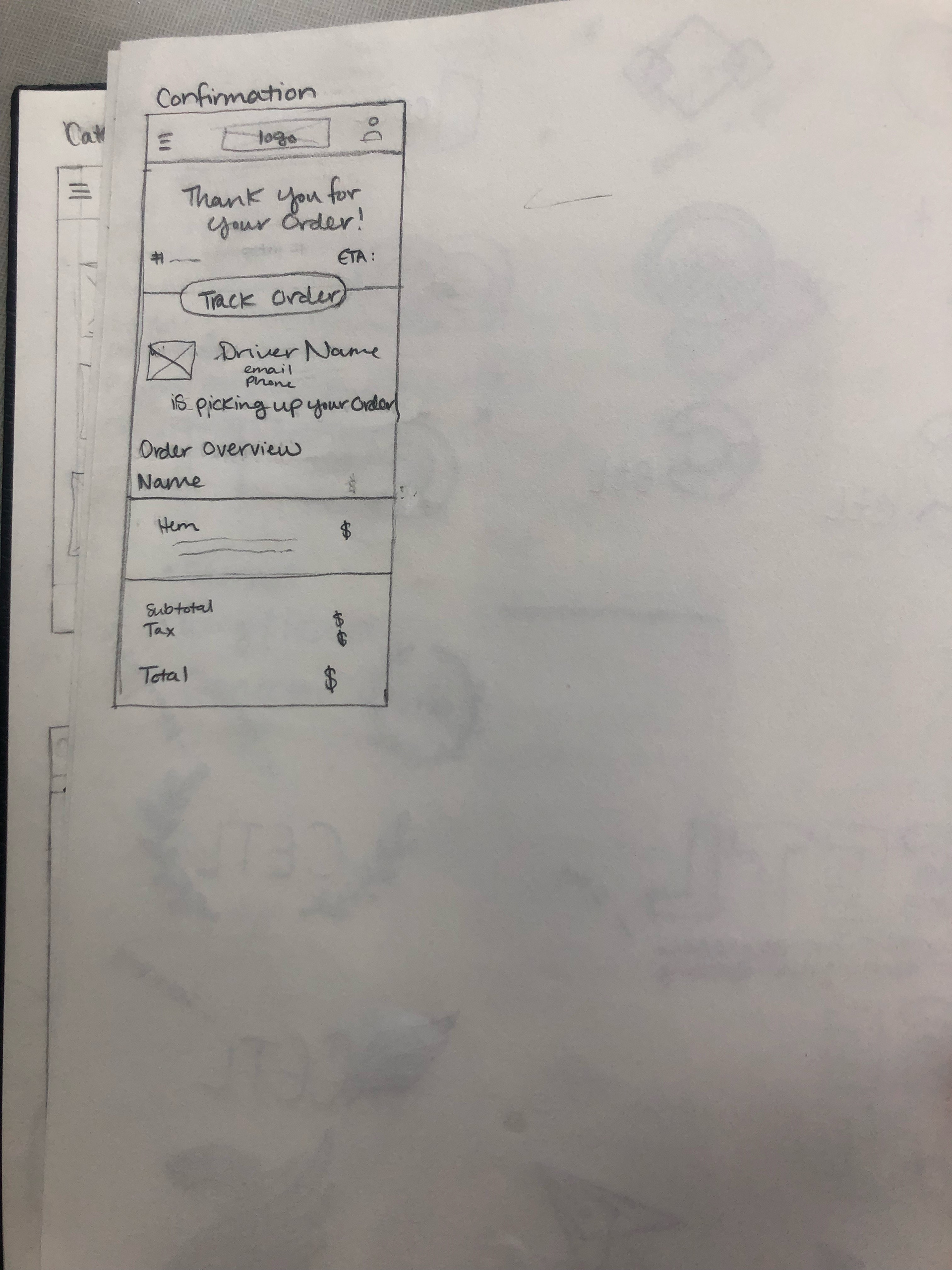
These sketches were my initial ideas for the design and experience of the Order Now feature. After analysis of other competitor applications, I wanted this feature to be clear in customers' use and flow while navigating the ordering process.
This step of the design process allowed me to express possible design solutions on paper before jumping into the application without being caught up in specifics such as color palettes and digital layouts.

Low Fidelity Wireframes:
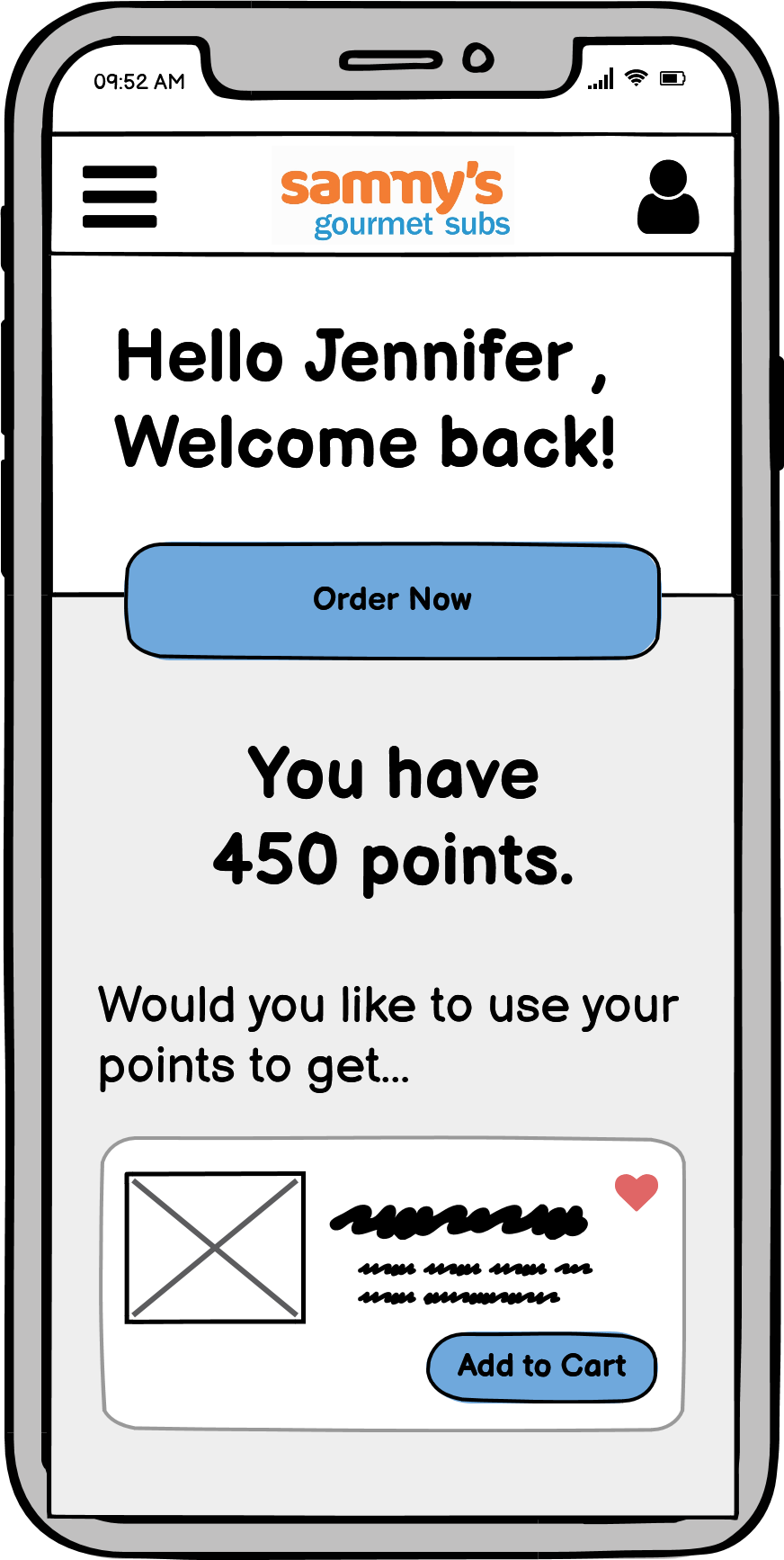
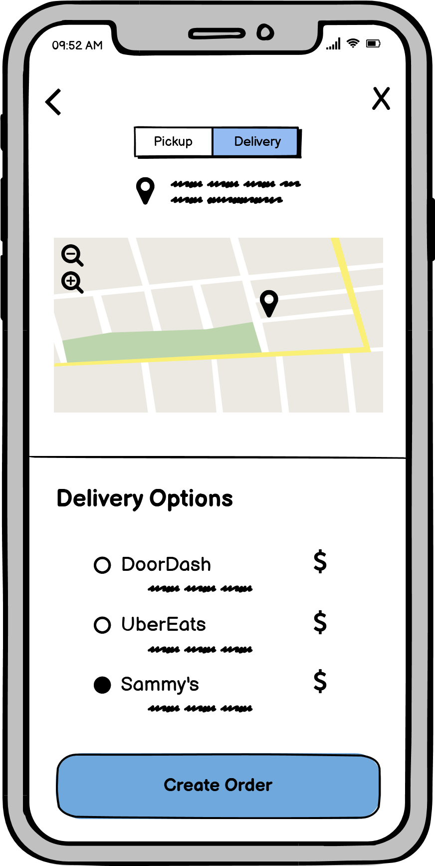
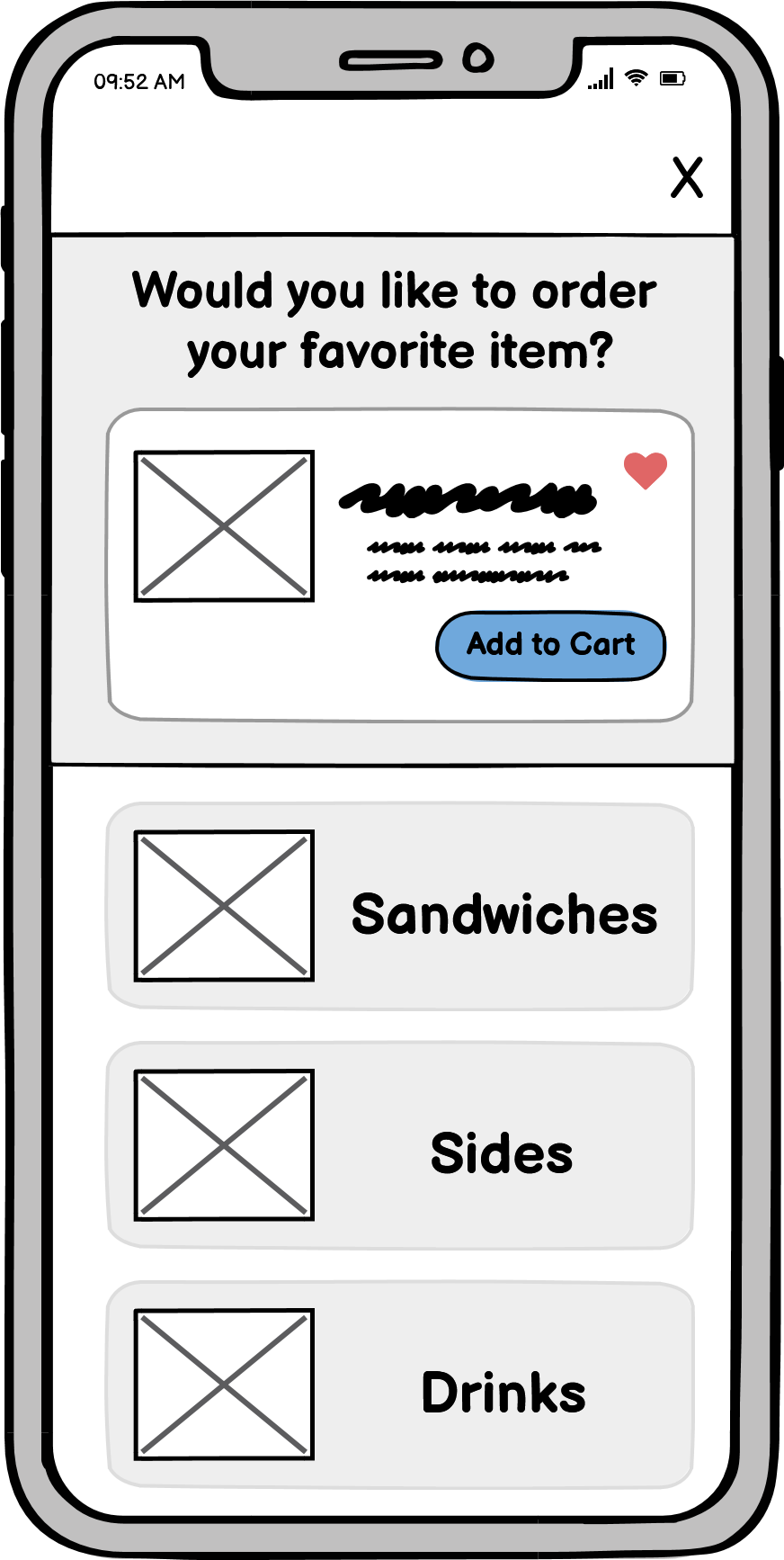
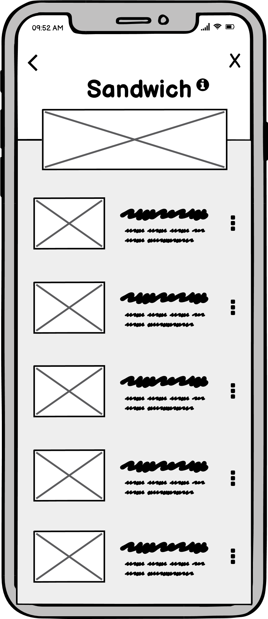
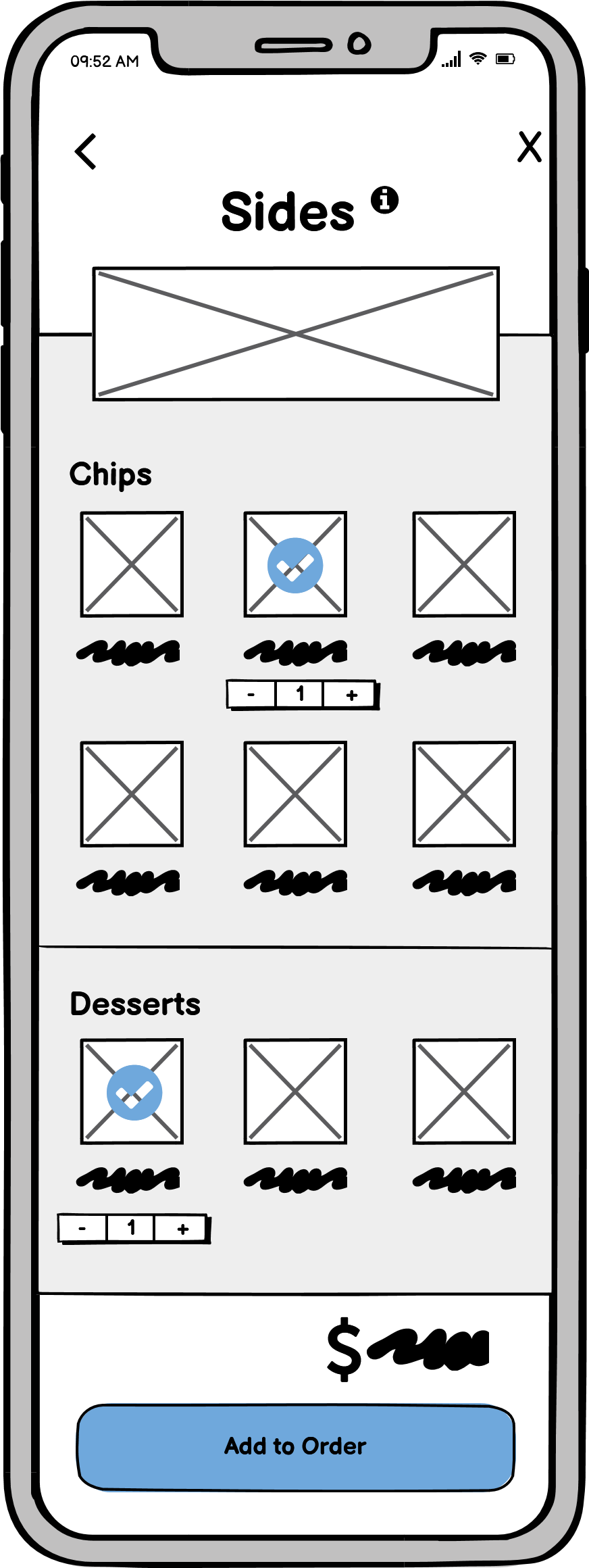
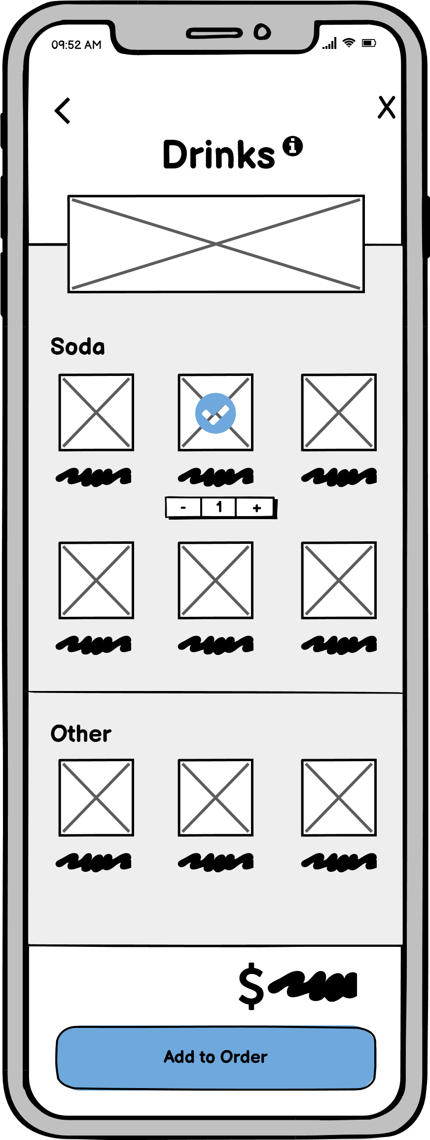
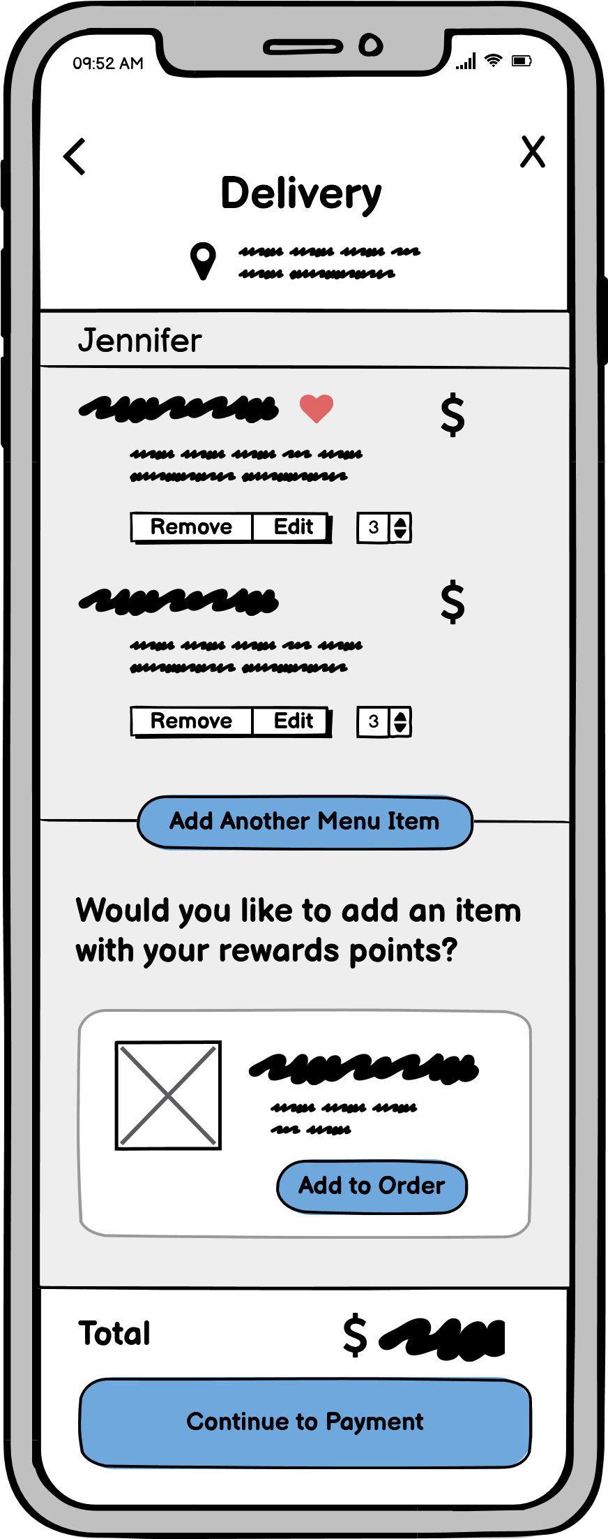
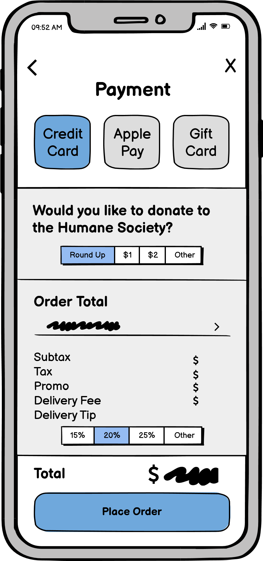
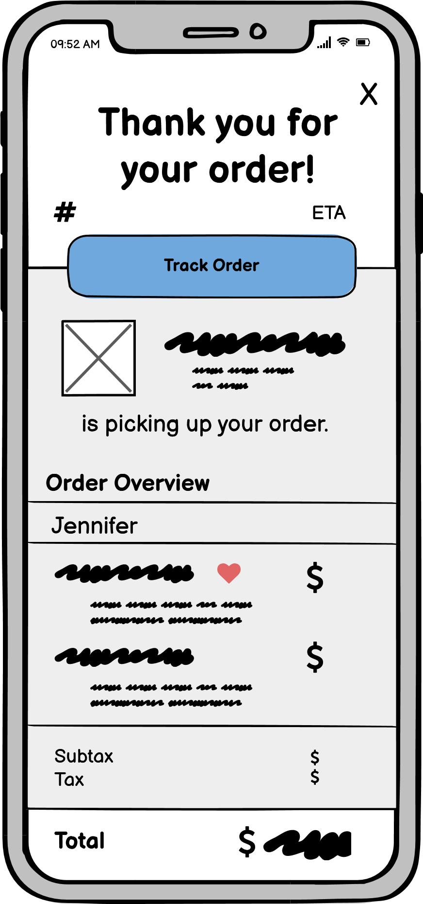
After my sketches and analyzing the business structure, I began to create low-fidelity prototypes in Balsamiq. My goal was to create proof of my initial concepts and mockup digital examples, as well as tackle possible design solutions.
My low fidelity wireframes were inspired by Chipotle's mobile application as many design features were clear and provided easy navigation during the order process. These wireframes depict the basic user flow of how customers would traverse across the application while focusing on working through design problems to find successful ways to present product information and choices to the user.


High Fidelity Prototyping:
After wireframing in Balsamiq, I assessed my design solution and started moving forward creating a high fidelity prototype of the application in Figma. As Sammy's has a personal and familiar tone to their brand, I incorporated rounded edges to shapes and buttons while also trying to give space among the page components to be more inviting for users. Some straight-edged shapes were utilized to create contrast among the rounded corners.
Since customers range among all age groups, designing an application that tailors to all levels of technological knowledge was the main focus for the success of the Order Now section. There are app features that are standard to functionality such as the scrolling pages and clickable buttons with selected indicators. At the same time, I implemented a few unique and modern features like the ellipsis pullout bar to add sandwiches as is or take the user to the customization menu. Users navigate by tapping or swiping to change their selection while seeing exactly what they will be ordering through indicators.
Sample Application:
For best viewing and use of the app's scrolling features, please open the Figma display below in fullscreen.
