About the Project:
This project was a class assignment set up to visually illustrate the historical importance of typeface designers and the font they are known for creating. In Illustrator and Photoshop, we were tasked to deliver research and information about our assigned type designer in a design-oriented way.
The requirement for this assignment was to utilize the space of an 11x17 inch poster that consists of three total colors outside of greyscale shades. Alongside these guidelines, the post had to include an information graphic, focus on architectural features of the typeface, and examples of where the font is used in business.
The Challenge:
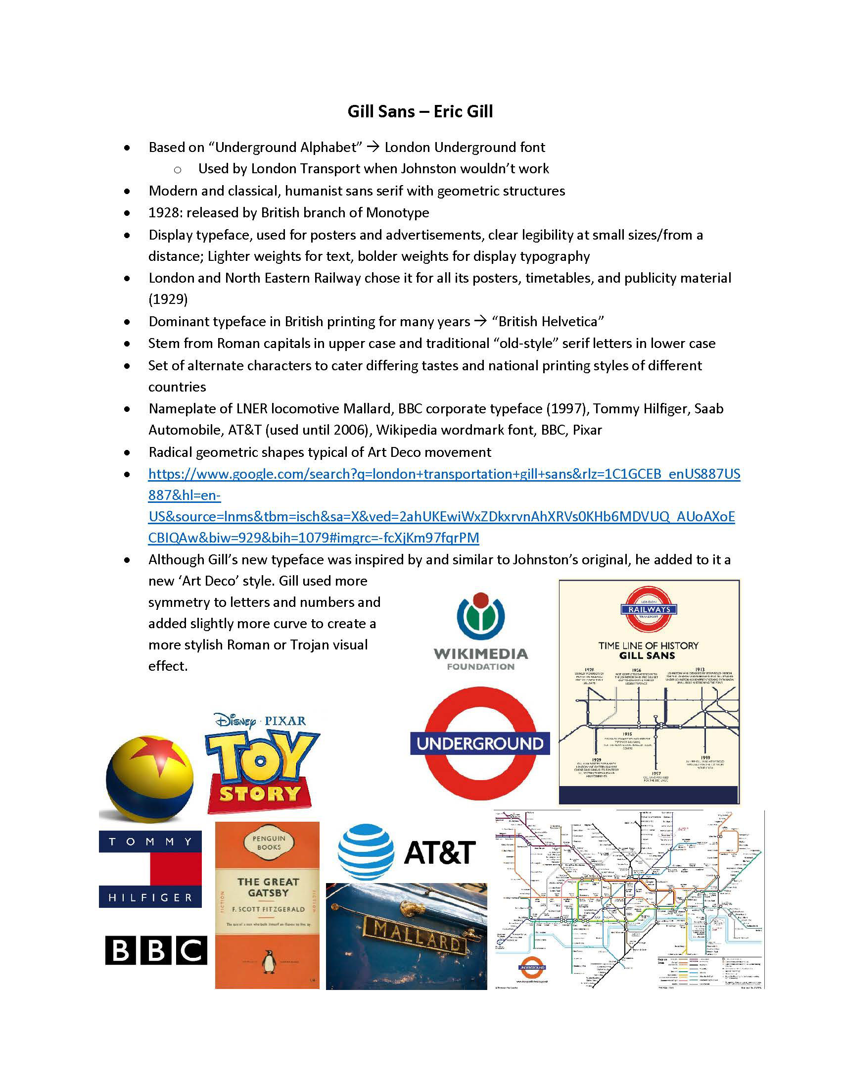
My main goal for this project was to represent accurate historical information and research about Gill Sans into one poster without it feeling overcrowded. Including this information in the required categories, fonts history, typography features, and usage examples, was the primary focus and challenge for this poster design.
Early-Stage Sketches:
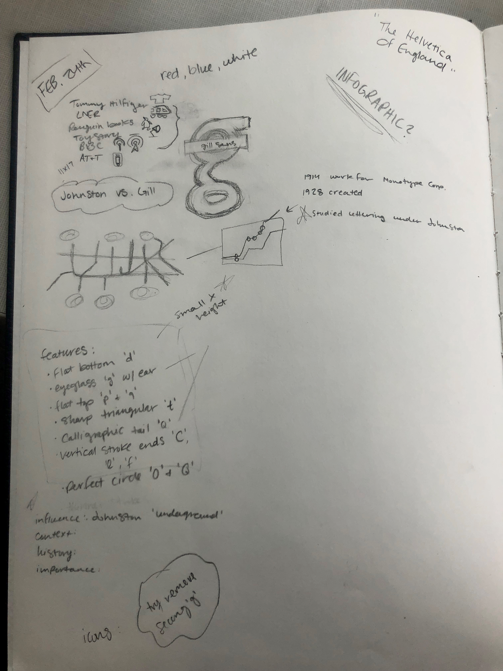
This project consisted of more research over sketching elements out, as it relied heavily on information and historical significance of Gill Sans and his typeface. As this font involved many connections with England, elements of the poster are greatly inspired and utilize these ties into the design. This main theme was on the London Underground as the font had substantial similarities to Johnston's Underground Alphabet font as it was Eric Gill's influence.
This step of the design process allowed me to gather my information before designing layouts or solidifying color schemes. In this case, a color scheme was partially set in mind as the color was associated with my research of the London Underground: red, blue, and white. I was able to make notes about appearance and how I envisioned certain aspects to look once the end product was completed.


Digital Mockups:
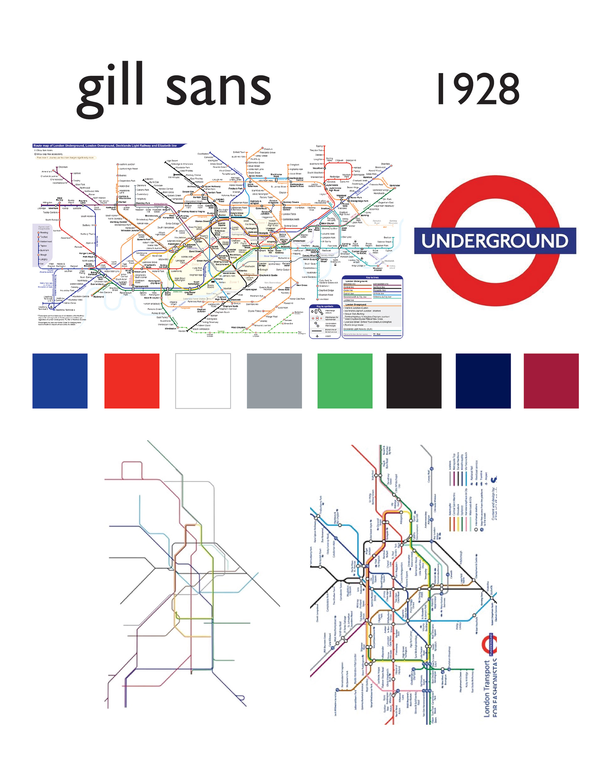
After solidifying my information and ideas for the poster, I began to create digital mockups of them using Illustrator and Photoshop. The main focus of this design focused on incorporating the London Underground logo into the eye of the lowercase g. Other elements are used around the letter as additional textural information about the typeface's history and representation.
The iconographical design of the right side highlights the research and historical journey of the Gill Sans typeface using the London Underground transit system. These routes represent the actual transit lines of the system and branch to show different information including how it was created, the significant features of the letters, and the iconography of business usage of the font. The information is presented at actual transit stop locations on the Underground map. Examples were depicted through iconography and text for a better understanding of the usage of the font in various companies and projects.
A couple of other design choices were included to bring out the focal letter. This included a black border that was representational of how advertisement displays in the Underground were displayed with a thick black casing surrounding it. To add a dimensional focal point, I separated the g from the flat background to make it stand out and bring attention there first. This was done by having the black border overlap the bottom of the g while the top remained above.
