About the Client:
Austin & Alcott is a hypothetical public library in Austin, Texas tailored to providing openly accessible resources and materials while creating welcoming collaborative spaces to enhance community members' experience. They focus on introducing an enjoyable and relaxing environment that encourages open and learning reading among all ages in the community.
The Challenge:
My task for this project was to create branding for the hypothetical public library, Austin & Alcott. Along with logos and other branding necessities, I needed to provide design deliverables for a library card, merchandise items, and social media presence.
Representing the brand of the library through multiple logo variations as well as creating indication icons for signage was the main goal to help identify A&A. My primary focus was placed on a design wordmark and icons to identify specific venues present within the institution that were representative and easily understood.
Early-Stage Sketches:
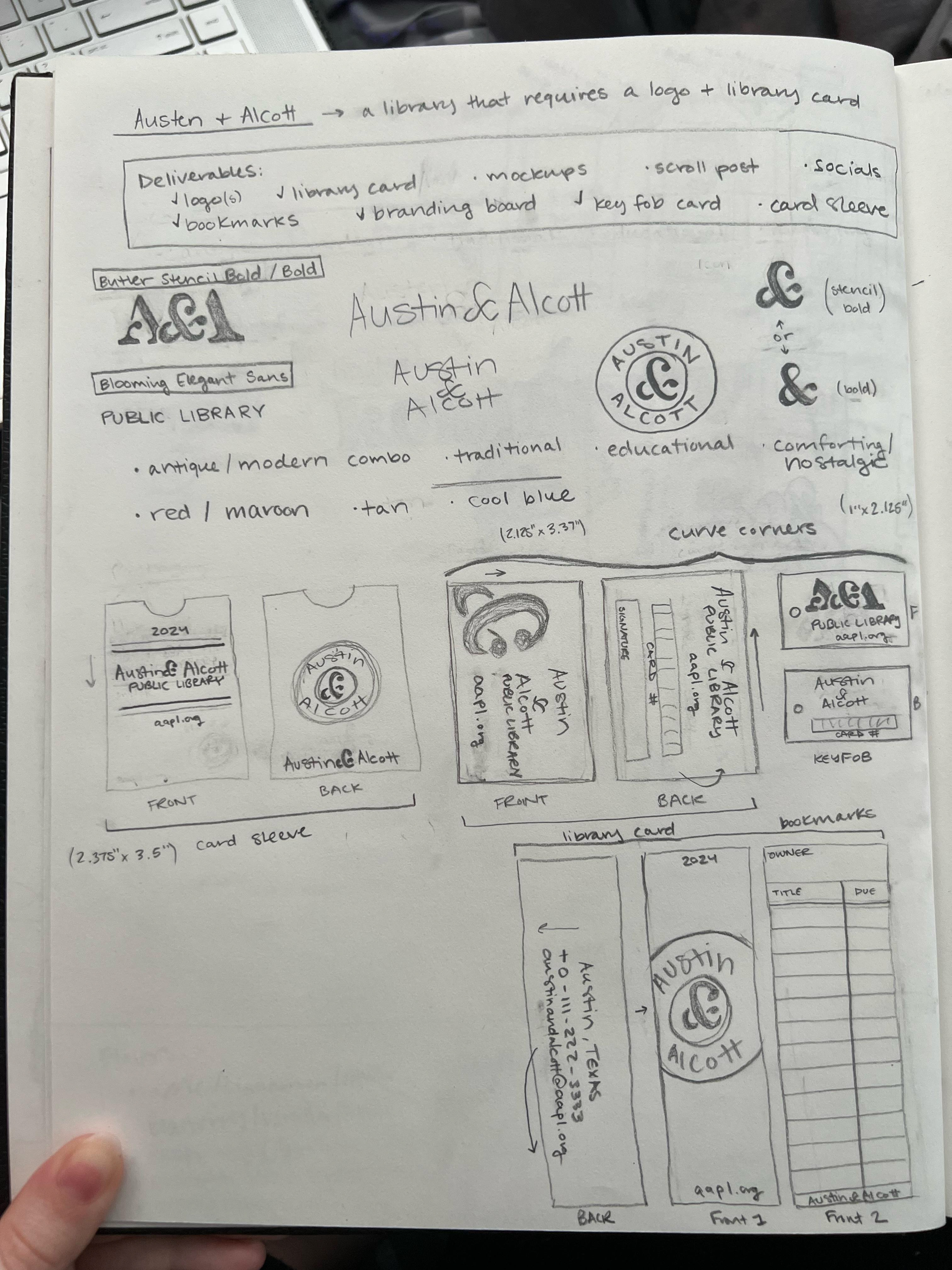
My first priority was to brainstorm ideas for logo variations and deliverables that represented a few keywords that I wanted the design of Austin & Alcott to highlight: comforting, modern yet nostalgic, traditional, and educational.
Taking these initial sketches, I was able to start drafting them out into digital concepts.
Branding Guide:
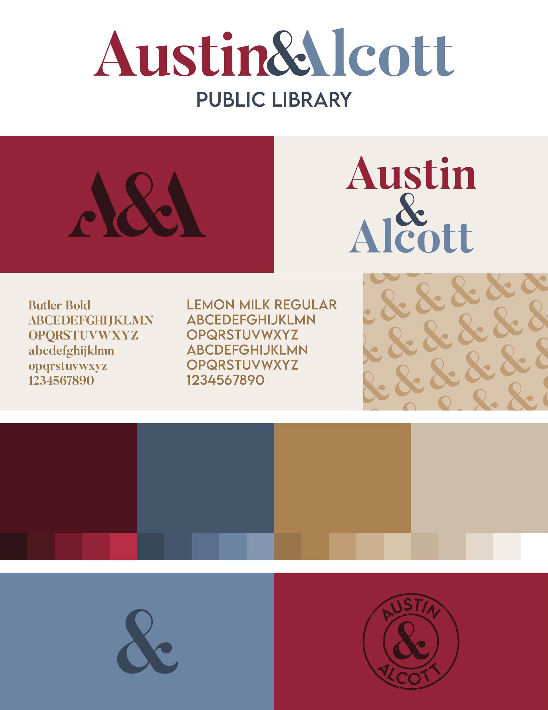
After discussion on various sketches, fonts, and color schemes, we established a cohesive brand identity to draw attention to events and emails from CETL. These set features confirm our logo variations, body texts, and colors in order to keep our individual work and other elements cohesive. Our finalized guide gave us logo variations that could be included across multiple designs and products that were being developed.
The colors that we chose to use were selected to reflect CETL and who they are; purple for wisdom, blue for technological expertise, yellow for warmth and positivity, and orange for humanistic approachability. Together, our color scheme creates a welcoming, professional, and bright feeling that reinforces our message of sharing positive perspectives, relationships, and experiences at the Center for Excellence in Teaching and Learning.
Digital Mockups:
At this point, I was able to mock up and incorporate the brand colors into the previously sketched designs. Each color was paired with a subject in the STEAM from the dots between the letters. For example, "S" is representative of science and was paired with green so the green dot on the circle was also representative of that same subject. The following items took elements from the branding guide to highlight the keywords decided: comforting, modern yet nostalgic, traditional, and educational.
Wordmark/Logo Variations:
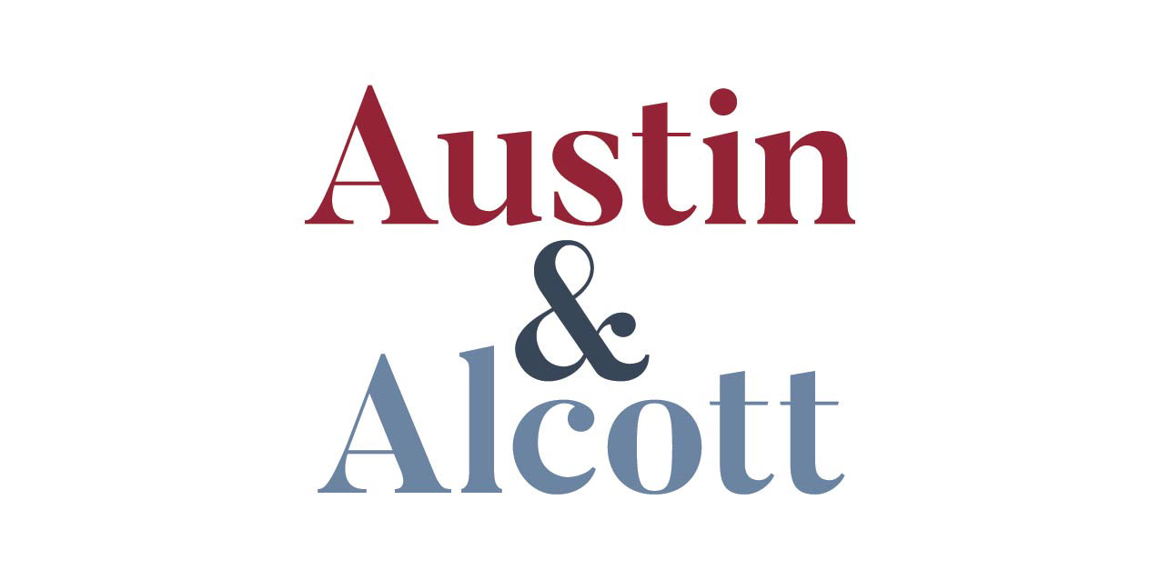
The name is the face of Austin & Alcott and the main representation of the library on documents, signage, merchandise, and more. Prioritizing that in branding, typography in the logo variations was the focus for name clarity and outreach.
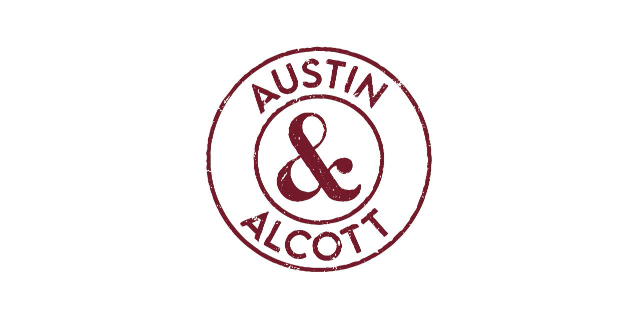
The shape of the ampersand was a unique design element to break up the title and was initially going to represent the wordmark for the brand. Later, I wanted something more substantial and fun to represent the library. A stamp-like wordmark was later introduced as it leaned into the theme of being traditional and nostalgic of old-school library stamps and mingled well with the modern elements in the design.
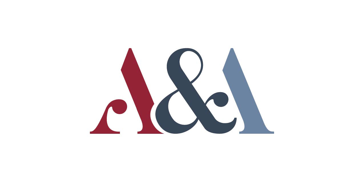
These variations can easily be presented in a black or white option as well as a colored version so the logo can be placed in different situations that seem fitting. Taking these initial sketches, I was able to start drafting them out into digital concepts.


Library Membership Items
Library Cards:
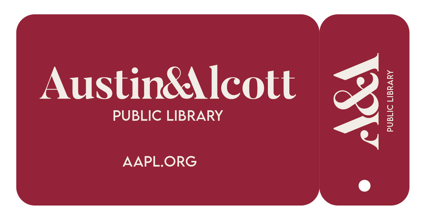
At Austin & Alcott, new library members receive their library cards and some free takeaways to encourage reading and learning. Library cards are set up in two formats: a normal-sized plastic card and a key fob version for ease of access.
these icon badges provide a clear distinction in room types in the campus buildings. Full-color badges are places outside the classroom settings to be seen and identified by passing students, faculty, and the public while in the facilities. They were designed toLibrary be placed either on the door or the wall near the entranceway for people to see and identify what venue they are looking for. The same colors as the wordmark are present to create cohesion and differentiate the rooms and their purposes. These were just three examples of what the venue icons would look like in representation of classroom type.

Bookmarks:
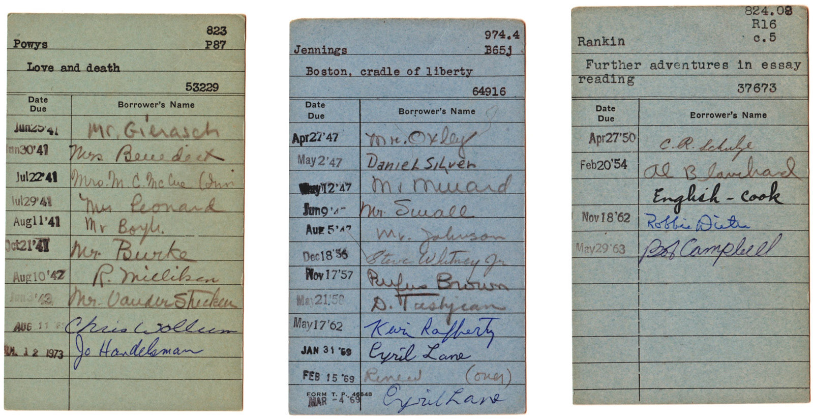
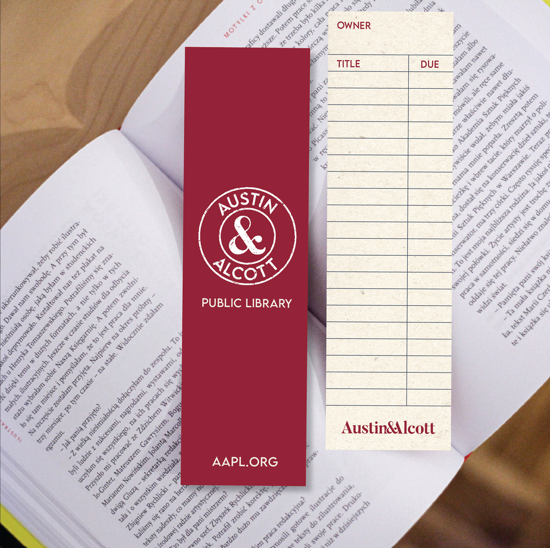
As Austin & Alcott strives to encourage reading and learning, physical takeaway items, including bookmarks, pencils, and stickers, are provided for any visitor to take at any time from their service desks. While these common library resources introduce a good way for the library to promote its brand to the community with its customers, they also provide a fun way for all ages to be inspired to read.
While bookmarks are handy for keeping your spot in a book, the library's bookmarks provide a reverse side that can be used for tracking the title of the book you are borrowing and the date it is due for a return back to the library. This reverse side resembles the nostalgic layout of an old-school library book card and encourages readers to have a fun way to keep track of their borrowed materials while also allowing them to always have an easily accessible reminder to view whenever they are reading their books.


Pencils/Stickers:
As Austin & Alcott strives to encourage reading and learning, physical takeaway items, including bookmarks, pencils, and stickers, are provided for any visitor to take at any time from their service desks. While these common library resources introduce a good way for the library to promote its brand to the community with its customers, they also provide a fun way for all ages to be inspired to read.

