About the Client:
This project was a class assignment set up to learn InDesign and create an informative editorial article. The requirement for this assignment was to create a two-page editorial spread that could be displayed in both a digital and print setting. It also needed to clearly communicate a subject of my choice that would be influential to readers.
The Challenge:
My main goal was on using typographic design skills to amplify the topic to be thought-provoking and challenge readers' perspectives of the subject. I needed to focus on finding a design solution that creatively gets to the point in order to connect and impact readers.
Early-Stage Sketches:
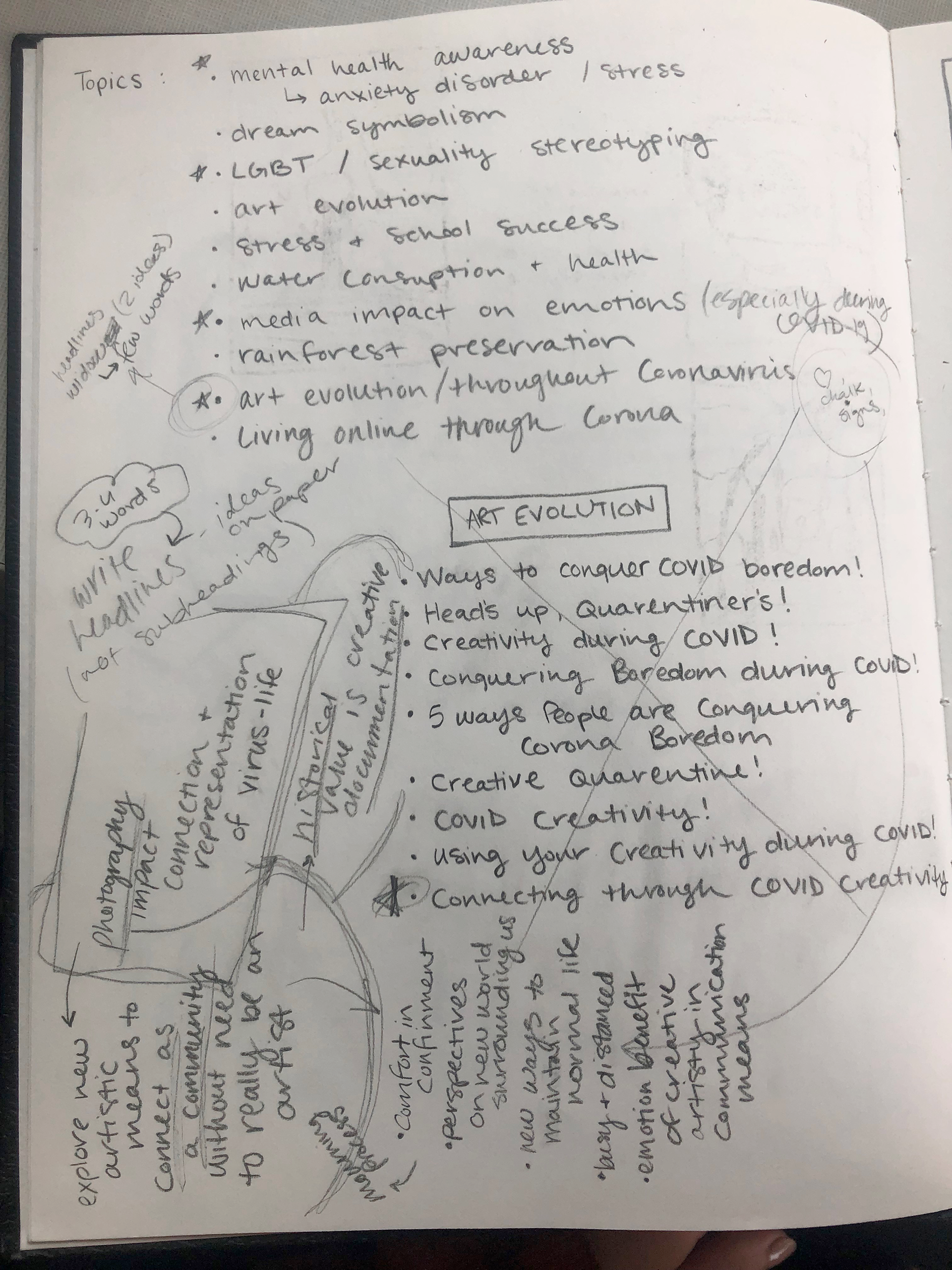
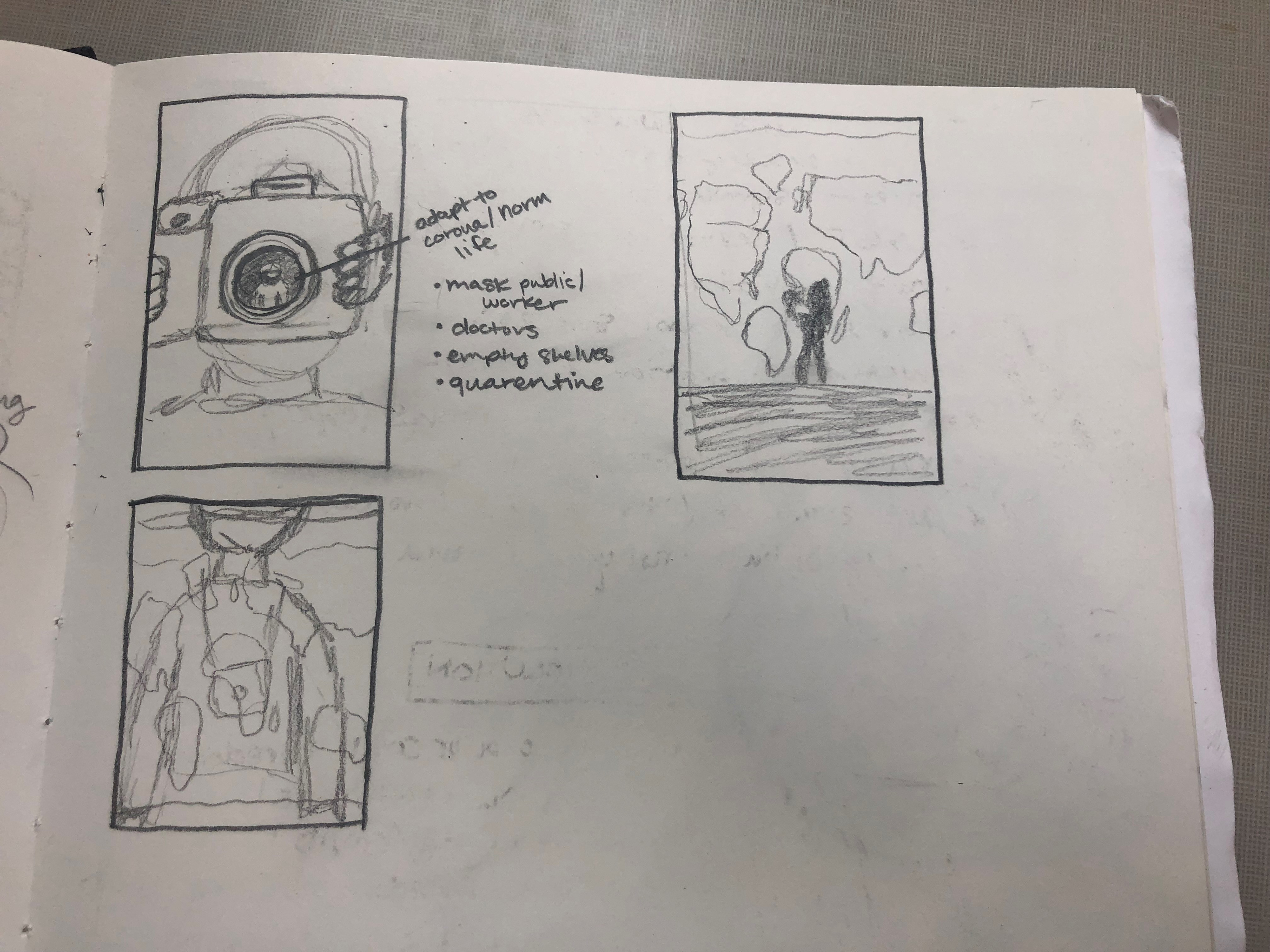
I started out by brainstorming topics and doing research on topics that interested me at the time while also focusing on what other people would want to read. As this was the height of COVID-19, most of my topics mainly focused on this subject in combination with other things. I was able to narrow down my subject to photography as an art form and how it became a major documentation source at the beginning of the pandemic.
From there I was able to focus on elements of design and sketch out ideas for the cover and the layout of the informative text. I wanted this editorial design to center around depictions of photography and common images pertaining to how the virus affected our lives.
While this was happening, I was continued to research a topic that was fairly new at the time. I began writing and editing decent chunks of text that would go on my second page of the spread to make sure the design and text would fit together. This was an interesting change as typically designing is the main focus for these types of projects and I got to try my hand in both areas.


Digital Mockup:
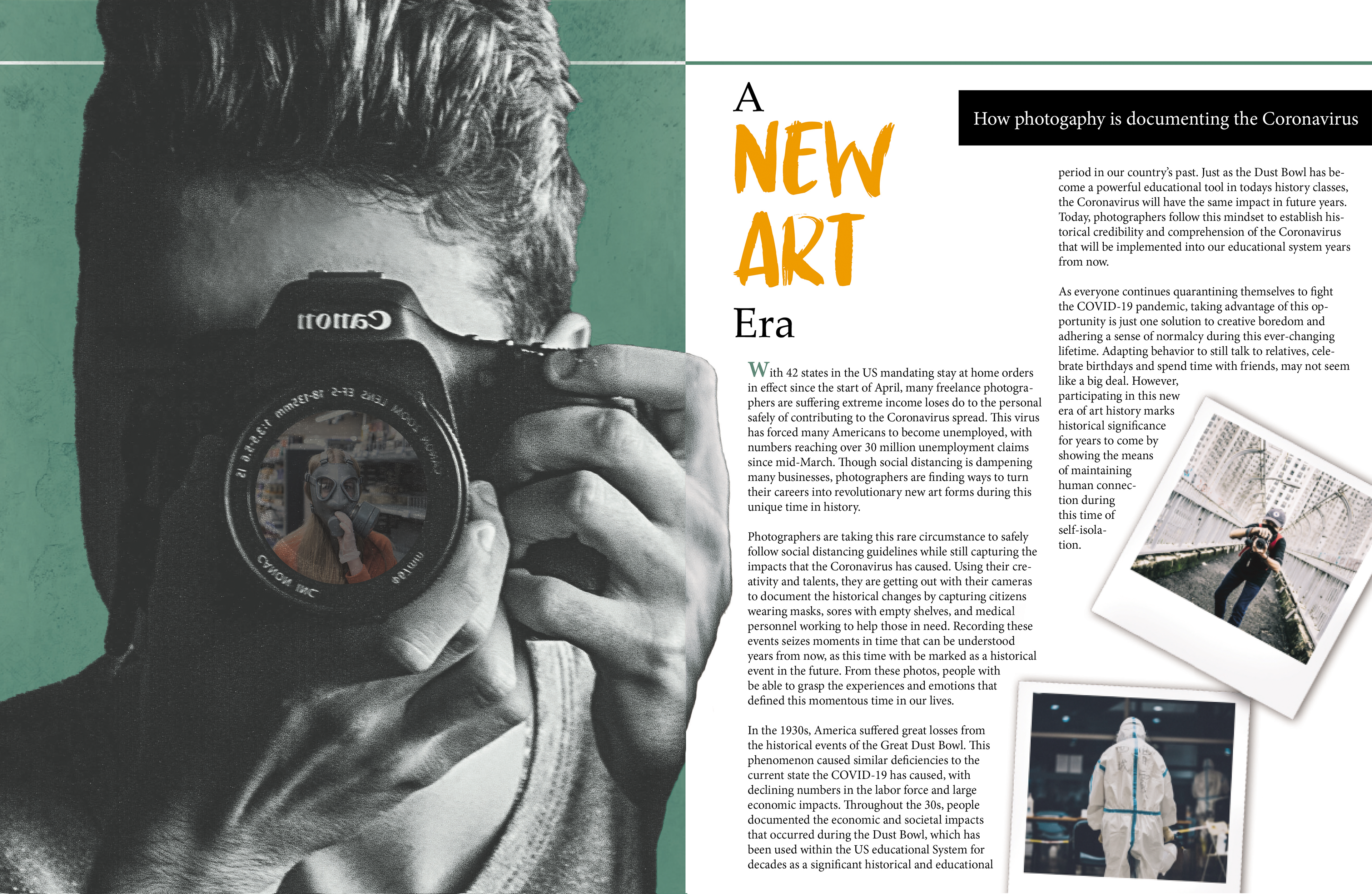
After solidifying my layout for the pages of the editorial, I began to learn and create a digital version of the spread in InDesign. This was my first major project using this program and required a lot of trial and error during my time with this project.
The design of these pages was focused highly on the photography aspect incorporated images associated with the events of the COVID-19 pandemic. The first page for example focuses on what is seen through the lens of the camera and what the photographer is focusing on major events that changed our lives drastically during this time. Other pandemic-related elements included masks, empty store shelves, and hazmat suits.
If I rearranged this design, I would have tried to make the text fit better in thinner areas. As there are a lot of hyphenated words in the text bodies, this can be hard to read and take away the focus from the subject to deciphering what the text is saying.

